
Conversion-First Redesign
EnKash is a B2B fintech platform helping companies manage payments, expenses, and financial operations.
As the business scaled, the website became the first place where CFOs and finance teams discovered EnKash.
But the experience wasn’t working.
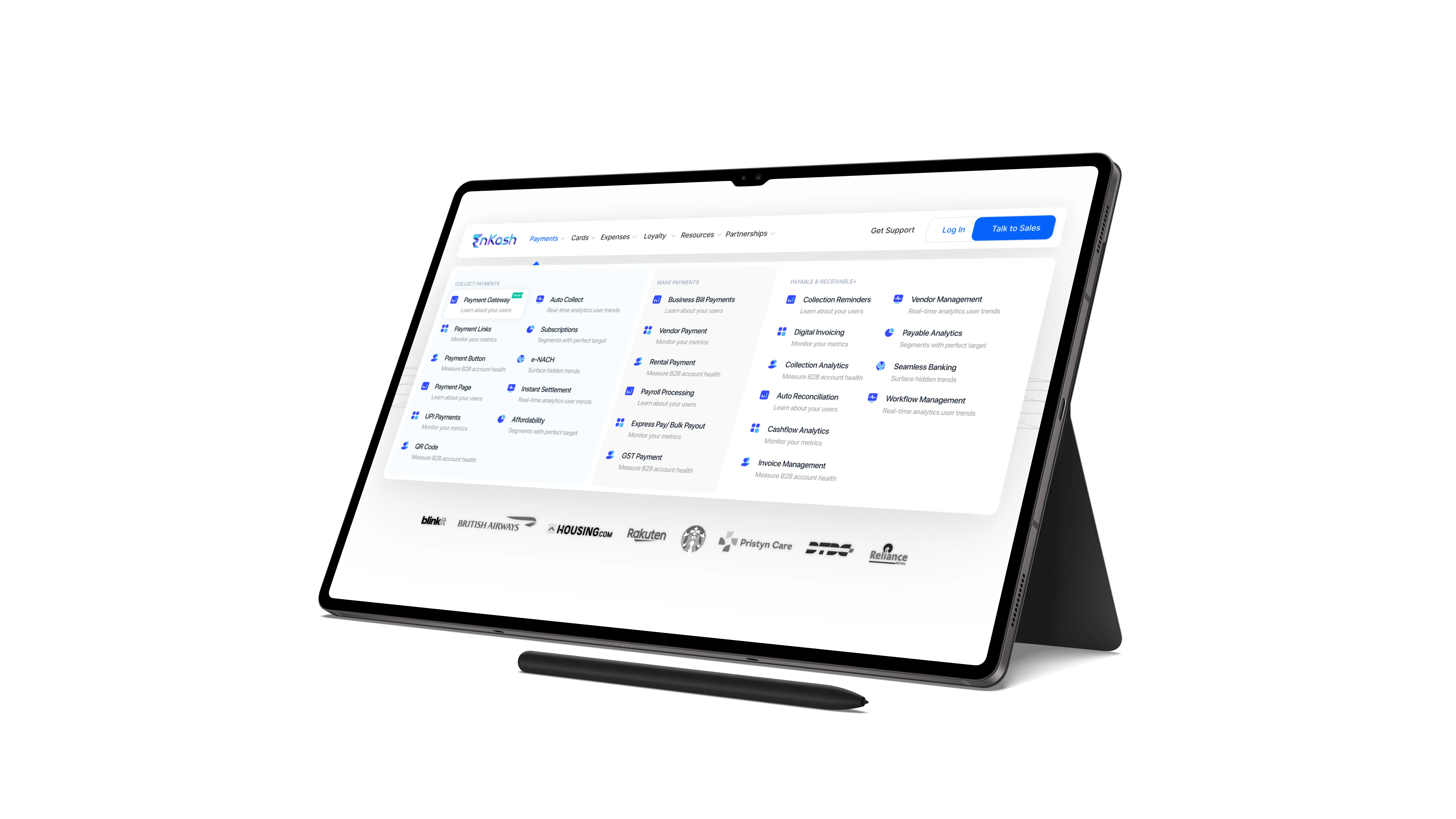
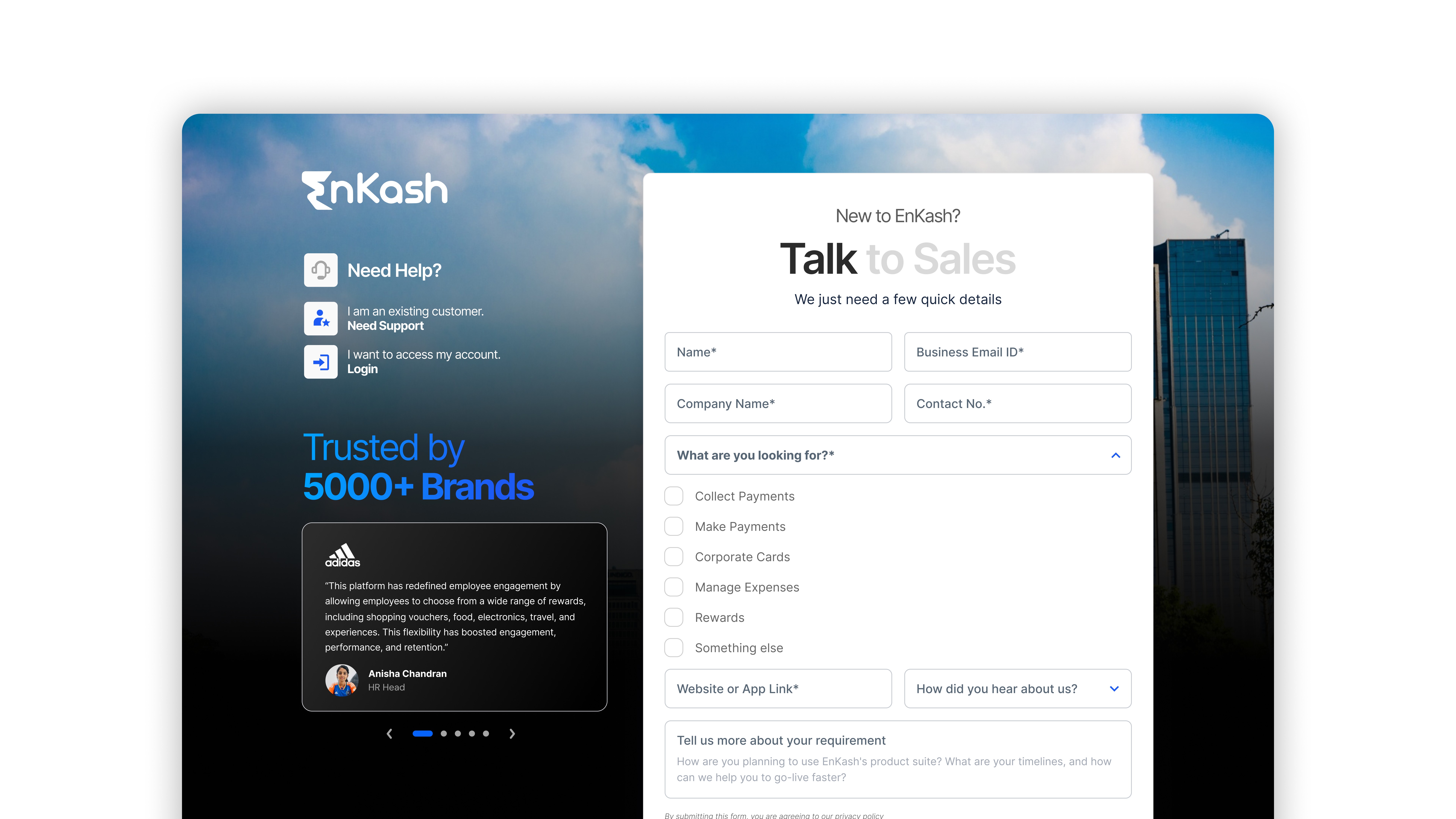
So over 8 weeks, we redesigned EnKash.com across 210+ unique pages to make it clearer, more trustworthy, and conversion-focused.
Delhi NCR
2018
Fintech
150 Lakhs approx
150+
Challenge
People were visiting the site…
But many weren’t understanding the product quickly.
Users struggled to answer basic questions:
What does EnKash do?
Which solution is right for me?
Why should I trust this platform?
What’s the next step?
The website looked outdated, navigation felt confusing, and the journey toward “Contact Sales” wasn’t clear.
Results
The redesign helped EnKash.com evolve into a modern, scalable acquisition channel.
After launching the new experience, we saw measurable improvements across both traffic and conversions:
Monthly website traffic increased from 50K to 150K visits
(3× growth in reach and visibility)Conversion performance improved by 30%, driven by clearer product messaging and stronger CTA journeys
A consistent design system was successfully scaled across 210+ unique pages, creating a foundation for future launches
Internal stakeholders also reported stronger outcomes in:
Brand maturity and trust perception
Navigation clarity
Product positioning for enterprise buyers
35%
Improved onboarding process
25%
Increase in user retention
1500+
Visuals Created


Process
1. UX Audit
We began by reviewing the existing website experience and identifying key friction points across:
Homepage clarity
Product discovery
Drop-offs before conversion
Content structure
This helped us understand what users were missing in their first visit.
2. Information Architecture Reset
Next, we reorganized the website around how business users actually think:
“What do you offer?”
“Is this relevant for my company?”
“Can I trust you?”
“How do I get started?”
The navigation became simpler and more intent-driven.
3. Journey Simplification
We redesigned the flow into a clearer funnel:
Landing → Understanding → Solution Match → Trust → Contact
This reduced unnecessary clicks and improved decision-making speed.
4. Visual System Refresh
To maintain consistency across 210+ pages, we focused on:
Clean fintech UI
Strong typography hierarchy
Modular reusable components
Premium enterprise feel
The redesign created a scalable system for future growth.







“ “This redesign wasn’t just about making the website look better — it was about making EnKash easier to understand, trust, and choose.”. ”
Hemant
CEO, Co-founder | EnKash


Conclusion
The redesign was not just a visual refresh. It was a structural reset that aligned product positioning, buyer psychology, and business growth into one unified digital experience.
